Art Exhibitions

Persistent Beauty

“all land, no matter what has happened to it, has over it a grace, an absolutely persistent beauty.”—Robert Adams, artist statement, The New West, 1974

Persistent beauty could be said to be the theme of the Robert Adams retrospective which closes this Sunday at the Yale University Art Gallery.  This is a wonderfully comprehensive show of the photography projects that Adams, a MacArthur “genius grant” recipient in 1994, has undertaken since 1968/70.  Sprawling across the first and fourth floors of the Gallery, “The Place We Live” offers numerous opportunities for contemplation and reflection.  Adams is not only a meticulous craftsman and a thorough master of his art, he is also an artist committed to preserving images of our nation—particularly the very land of our nation—that speak eloquently about who we really are.  The amazing paradox is that even when what he shows us is not “a pretty picture”—the tract housing, the prefab corridors of business, the glut of tacky products, the clear-cutting of huge swathes of primary growth forests—each image still has considerable aesthetic fascination.

Adams sets his work in that cultural space where natural beauty meets the beauty of form in the artist’s keen eye to create the man-made beauty of his photographs.  “Beauty is in the eye of the beholder” is an old adage, and Adams gives it new spirit, teaching us to see how he sees.  Every image shows a lot; in the jargon of our times, we might say “contains a lot of information.”  But in Adams’ images, information is not the guiding principle.  Certainly, we learn something about Denver  or Eden, CO, in looking at these pictures, and about areas of CA and even a sad and striking memorial for U.S. war casualties, but Adams’ work is not simply about clueing us in or letting us know.  His photographs combine a formal, compositional clarity with an unflinching sharpness that makes us think about seeing, about how we choose to look at things or not.

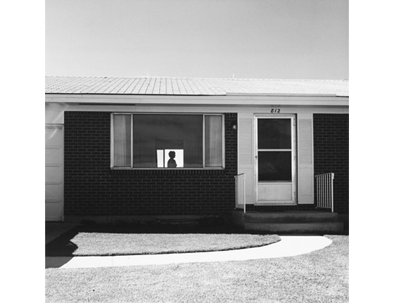
I toured the first floor exhibit last Saturday with my friend Rob Slifkin, an assistant professor of Art History at NYU, and we spent almost two hours examining each photograph closely, rarely flagging in our admiration of Adams’ art.  The earliest pictures here—so stark and yet so formally appealing, landscapes with an unerring sense of how to make us feel the contrast between the wide spaces of the west and the cramped, miminalist possibilities of the man-made objects and habitations of the time (early 1970s)—captured much of our attention, forming a canon by which to judge Adams’ subsequent work.  The famous photograph of a silhouette framed in the picture window of a modest, Sixties tract-dwelling speaks with the eloquence of the perfect shot: both emblem for an entire way of life, but also an aesthetic statement about surfaces, shading, light.

In shot after shot, in his earliest period, Adams performs wonders in making the mundane and unprepossessing reveal its beauty to the eye.  A street at night, where the streetlights create huge dark mounds of trees and a brightly enticing far horizon; a gutter near an undeveloped area where the asphalt road, concrete gutter, and swathe of gravel and dirt create a triptych of surfaces, each with a particular texture but also a particular reference; a baby in a car seat sitting on a stoop outside a closed screen door—a gesture toward the ephemeral made monumental, as if the child’s entire life could be summed up in the framing of that instant.  We found ourselves making comparisons to Cézanne, an artist whose grasp of the formal principles of his art created new ways of seeing, looking and showing, and whose works, like Adams’ photographs, give the eye much to take in, a fascinating interplay of foreground and background and shapes and planes, voids and solids.

As we went on, it became clear that Adams’ intentions were changing.  There was a period where his work became almost “Victorian” in its willingness to court “pretty” images—but with a sense of the fragility of a copse of trees, or of a place that would be done away with due to urban sprawl.  By the time we were looking at the trash and detritus, the building sites and big department stores of the late Seventies and early Eighties, it became clear that Adams’ art is also socially conscious to a degree that many artists like to pretend they are.  Without lecturing us, or at least by leaving the editorializing to titles and wall text, the exhibit turns a corner and begins to consider how hard it can be to find “persistent beauty” in the utter lack of taste and aesthetic sense in much of what America happily produces and consumes—and discards.

If you lived through the periods Adams is depicting, you might find yourself wincing with a terrible recognition of how “material progress” not only despoils our land, it substitutes one environment for another: one is pleasing to the eye and fully sensual in its engagement with our senses, but also, perhaps, sublime in its existence beyond us; the other is ours—indifferent to our natural preference for the irregular, the unplanned, the untouched, it simply replicates our endless search for greater ease and comfort, for more stuff, and our worship of gimcracks and commodities for the sake of novelty.  Adams doesn’t need to write manifestos on the wall-cards.  His images speak for themselves.

At the end of the first floor exhibit, we stood before a wall of images depicting people—actual figures in Adams’ work to this point had not been plentiful but were always meaningful.  Here, we saw people of the early Eighties in shopping mall parking lots, on small town streets, in suburbs that could be anywhere in the U.S.  We had already moved from considering how Adams had gone from existentialist and minimalist in his approach—showing us the “thereness” of unadorned human habitations and businesses in a vast, indifferent space—to social and editorial—showing us a way of life and its depredations.  And yet the images could still yield affectionate responses and could show us “us” in no uncertain terms.  In the end, we were back to formal considerations, but with a difference: to see how Adams’ artful configurations of space, shadow, figures create subliminal messages about our mortality.  Rob cited Susan Sontag from “On Photography”: “Every photograph is a memento mori.”  The power of these shots—and the artfulness of their seemingly artless presentation—is in how Adams makes us aware of what Sontag means when she says: “To take a photograph is to participate in another person's (or thing's) mortality, vulnerability, mutability.”  What this leaves us with, then, is the effort to understand the terms and values of our “participation.”  For we too are mortal, vulnerable, and mutable.  And these pictures make us feel that.

Rob went off to another engagement, and I toured the fourth floor on my own.  I have to confess, I took it a bit more speedily.  The sheer number of photographs was becoming overwhelming.  And perhaps, in the reflections above, I’d already traced a path to my moment; to the place in time and the time of the place where I was doomed to be.  Or something.  In any case, the upper floor is more emphatic in its outrage.  Here, Adams brings his camera’s clarity to the tragic dimensions of our time: lives lost to war and landscape shorn of ancient trees both speak of phenomenal levels of waste, and, as photographs—as with shots of the northwest coast and pleasure-seekers, or a descending plane frozen, entering the open sky above a river, or of fragile plants posed almost as decorative motifs—make a strong claim on our attention.  We are looking at how we live, and Adams wants us to reflect on what we see, and what that says about who we are and what we’re willing to live with.

This is a powerful and important show by an American treasure: an artist of superb skills and worthwhile convictions.  Robert Adams, The Place We Live, is not to be missed.  Its beauty persists.

Robert Adams The Place We Live A Retrospective Selection of Photographs Yale University Art Gallery New Haven, Connecticut August 3–October 28, 2012
http://artgallery.yale.edu


Story Art

Visit 756 Chapel Street and step into the world of Dan Greene: colorful pastels, boldly drawn, presenting the mysterious activities of heroes and villains. There are archers, scribes, monks and nuns, and the fearsome knife throwers, trained by the villainous Hypnotist to thwart the lovers seeking a path to the Blue Fort that contains a mystic orchard.

Greene, currently a singer/songwriter with his group The Mountain Movers, first became known in indie music circles while a member of the group The Butterflies of Love, a band which had radio and concert success in the UK from the mid-90s to mid-2000s, even performing on air for legendary DJ John Peel.  Around the time that he moved on from that band and formed The Mountain Movers with bassist Rick Omonte (aka Shaki Presents, former scheduler of the free concerts at BAR), Greene began to create drawings that, at first, were illustrations for a long poem, but that gradually took on a life of their own.  At times Greene draws something and then has to decide what story goes with it, or how the image fits in with what he has already drawn.

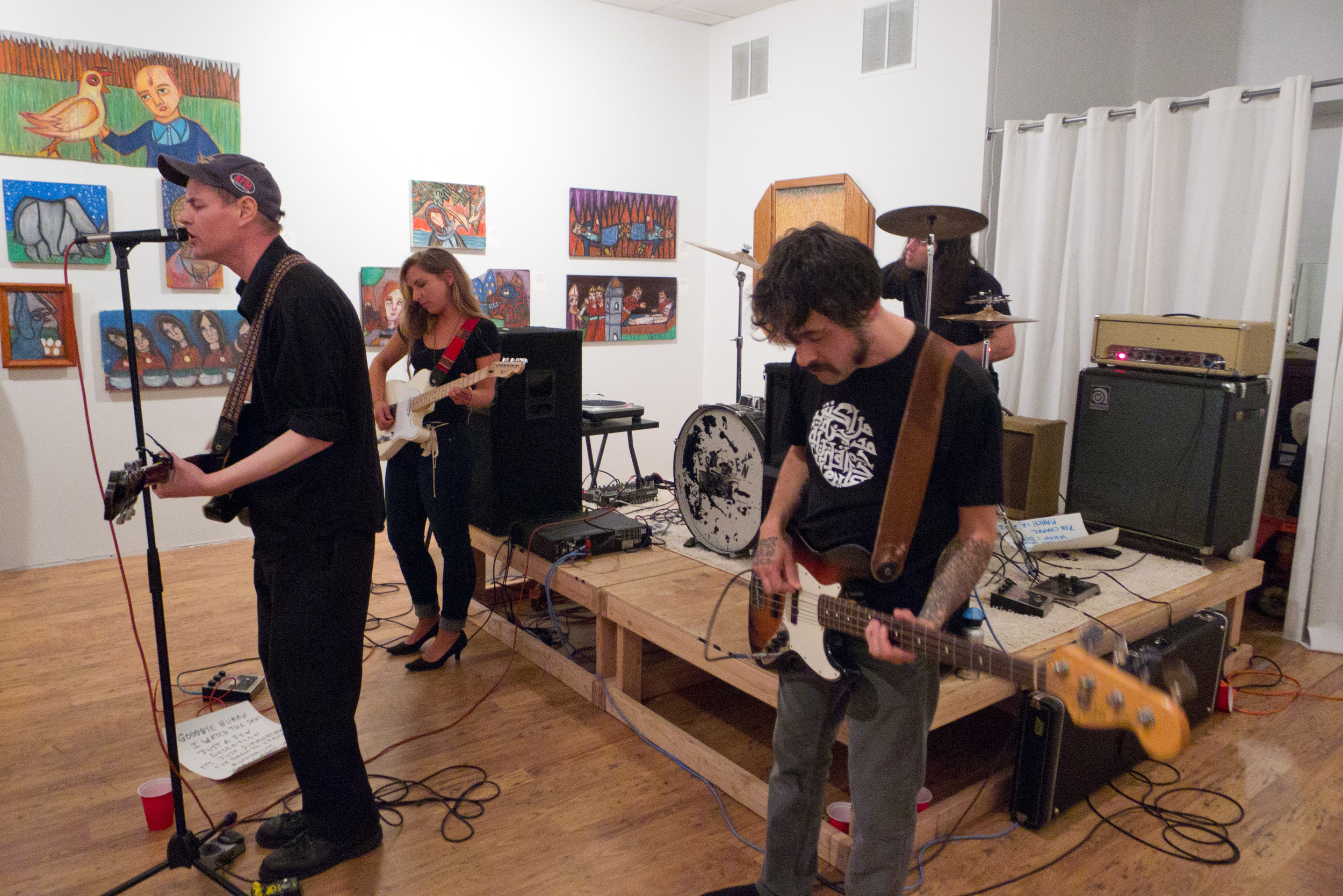
A selection of the voluminous works Greene creates are now hanging on the walls at Intercambio, in a show called Knife Thrower.  The show is the result of the efforts of Omonte and his partner Gabrielle Svenningsen, curators of the show under their name Ephemeroptera, to bring Greene’s work to the public.  Each image is accompanied by lines typed by Greene to indicate what is happening in the picture.

Greene, originally from Worchester, Massachusetts, is a teacher at a private elementary school in New Haven, and describes himself as self-taught both as a musician and as an artist.  In both music and art he prefers a do-it-yourself style and an aesthetic that is rough-hewn and ready made, using “cruder equipment.”  The surfaces he adorns with his art are generally found on bulk trash day in the area: scrap wood, pieces of furniture, a door, old cardboard.  And Greene is quick to point out infelicities, as for instance a fixative unevenly applied, or a drawing that suffered rubbings and discoloration simply because he hadn’t considered preserving or displaying it.  Previously, he was happy to give drawings away to friends who admired them and made no effort to title or catalog his output.  As an influence, Greene cites frequent visits to exhibits of folk and outsider art in New York; his primary development as an artist has been to become fluent with his own childlike, naïve, and unrefined style.

While certainly describing the simplicity of Greene’s line drawings, and his use of flat planes of color in a manner reminiscent of cartoon panels, such terms don’t do full justice to the odd power of the works on display.  One can’t help thinking of medieval artists, not only because of the medieval characters and settings of Greene’s pastels, but also because Greene’s compositional spaces and his sense of figure derive from a medieval manner—unlike many fantasy artists who render the Medieval with the overwrought renderings of pre-Raphaelite artists.  Stained glass images come to mind, in part because of the saturated colors Greene achieves.

Sometimes the borrowing is deliberate, as for instance in Handing Over The Works, one of the more complicated compositions that clearly draws upon St. Bridget of Sweden (an image of the 14th century original is stuck to the wall next to Greene’s pastel in the exhibit).  Both Greene’s version and the medieval picture portray the importance of texts.  In Greene’s tale, particular books create the visions that enable the First Saint to envision a new city, or monastery, a refuge for study and what we would call sustainable living.  Both images show three levels of action, with communication occurring between the saints of the past and the devout of the present.

More often what is recalled by Greene’s art isn’t so much a specific image or artist from the past, but rather an access to stories that we find in storybook art for children, in comix or graphic novels, or in illuminated manuscripts: elastic space, mostly frontal presentations, details and texture achieved by overlays of color (Greene begins each composition with yellow and orange outlines, working toward the darker and heavier colors), and the aura of a coherent if otherworldly narrative.  Blue Knife Thrower, for instance, might be taken at first for an alien or a spaceman or super hero until one realizes he is garbed in mail, but even so the mask-like head somehow communicates a haunting character.

And the imperfections that indicate Greene’s less than curatorial approach to his art add a sense of the haphazard and spontaneous.  Almost as if the works we’re looking at are relics from the world Greene depicts.  After The Kill, depicting the Nun in Black with the head of a vanquished Knife Thrower, looks rather talismanic, as if a heroic image carved into wood and kept by the people of the monastery to commemorate an important victory.

As with the best fantasy tales, Greene’s Knife Thrower implies an extensive backstory, where animals can be hypnotized to aid the Knife Throwers, where the lovers—the Nun in Black and the Skyscraper Worker—can reach the orchard or fail and die and return to try again and again, where there is a Land of Stalagmites, where the unwary may be impaled, and a Land of Pillars, and other lands that Greene’s imagination, guided by what his hand discovers in drawing, has yet to explore fully.  As the story continues to evolve, so does Greene’s music.  The Mountain Movers, whose three vinyl albums are on sale at the gallery, have also been evolving from “folk garage band” to something more driving and raucous. The band performed at Knife Thrower’s opening and created a loosely textured sound to accompany the beguiling textures of Greene’s fantasy art.

Knife ThrowerDrawings by Dan Greene

An Ephemeroptera exhibition

Intercambio, in association with Project Storefronts 756 Chapel Street, New Haven May 12-June 15, 2012

Photographs by Kurt Heumiller

Art in Westville: Frank Bruckmann and Susan Clinard

Hey, we owe these guys!  Kehler Liddell Gallery was more than kind enough to play host to our book party on Tuesday, December 7.  At the party, attendees were actually privy to the art exhibit mentioned below prior to its official opening by about five days.  (See, there really are benefits to subscribing!) We're happy to return the favor!  Come see the show and get some of that culture thingey that Sarah Palin is sooo lacking in.

Bruckmann and Susan Clinard

December 9 – January 16, 2010

Kehler Liddell Gallery 873 Whalley Avenue New Haven, CT 06515 tel: (203) 389.9555 www.kehlerliddell.com

Gallery Hours: Thursday, 11-8pm; Friday, 11-4pm; Saturday and Sunday, 10-4pm; or by appointment.

Kehler Liddell Gallery is pleased to present a two-person exhibition of new paintings by Frank Bruckmann and new sculpture by Susan Clinard that revel in the spirit of antitechnology art to communicate emotion and allegory.

Before moving to New Haven, Frank Bruckmann studied at École des Beaux-Arts in Paris, where he spent nearly a decade in France and Spain coping the masters in the great museums and painting landscapes in the cities and countryside. These years of intense study inform his rich palette and humanist depictions of contemporary America, which provide him with endless sources of inspiration. Both a plein air and studio painter, Bruckmann paints that which surrounds him. Past series depict local merchants in their shops, cityscapes of downtown New Haven, sublime views of West Rock, and landscapes of Monhegan Island, Maine, where he frequently travels.

For this show, Bruckmann will present new small and medium sized paintings of the volcanic Gabbro rocks in Monhegan that are more detailed and abstract than anything he has done before. The paintings investigate the mysterious surfaces and orifices of the purple-black rocks, delicately cut by white lines (quartz) and speckled with orange clusters (fungi). The paintings investigate new textures, shadows, colors, and reveal secret biological world that fights to live in places the human eye cannot see.

Susan Clinard is one of those rare artists who can work in wood, clay, bronze, stone and metal. Real people, experiences, and stories inspire and inform her work, which confront issues of inequality, fear, compassion and courage. Since giving birth to her first son in 2004, motherhood and life cycles have become major semi-autobiographical themes.

For this show, Clinard has treaded on radical new ground, and will present a series of mixed media wunderkammers, (“cabinets of curiosities”). Wunderkammers were popular toys of nobles in the late 1500ʼs, before the advent of public museums. These cabinets, ranging from small boxes to library-sized rooms included collections of oddities that belonged to a specific natural history—precious minerals, strange organisms, indigenous crafts, collected from civilizations and placed in a microcosmic memory theatre. Clinardʼs wunderkammers incorporate this idea of the biological unknown, and organize the various found elements in compartments that suggest an internal, psychological narrative. Each cabinet shelters its own landscapes, precious moments, and measurements of darkness and clarity.

Clinard will also present a new major installation titled “Procession,” which incorporates figurative elements that she is known for. Unlike her traditional clay busts, the line of male figures is roughly cut, minimal and distorted. Positioned on a wheeled platform, the men move in a unified direction with a clear purpose, lending to a strong compositional impact. The work responds to the ceremonial weight and cultural significance of processions in contemporary and ancient history-- their association with life, death and strength in unity.